|
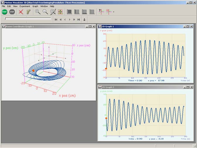
The 3D graph shows the motion of a free-swinging
pendulum.
The graph on the upper right is the x-coordinate
(red axis on 3D graph) vs. time, and the lower right graph is
the y-coordinate (green axis on 3D graph) vs. time. The two time
graphs together show how the greatest excursion of the pendulum
moved between the x- and y-coordinates. The pendulum swung in
an ellipse that rotated in time.
<< Back
|